Showing advertisers how Meta uses their data, without hurting adoption
Context
When someone sees an ad on Instagram or Facebook, they usually have to tap it and leave the app to learn more about the business. Meta is evolving ads to show more business information inside the ad itself. For example, a text-based summary of the business, more product images, or links to other pages on the advertiser's website. These are now called interactive experiences.
Within interactive experiences, Meta pulls metadata from the advertiser's ad sources, like their website, product catalog, or app store listing. Advertisers can review their ad sources and metadata when they set up a campaign.
Interactive experiences change what people can see and do around an ad, but they do not change the advertiser's own image or video. Since this is a completely new mental model for advertisers, we had to create a new category for these products.


Problems
For advertisers
- Advertisers saw changes in their ads they did not expect. Interactive experiences were on by default. The products sat in a sub-menu within a modal that few advertisers opened, so many could not find where they had opted in or how to opt out.
- Advertisers could not connect their metadata to the interactive experiences it powered. They approved ad sources in one step of setup and controlled the features in a different step.
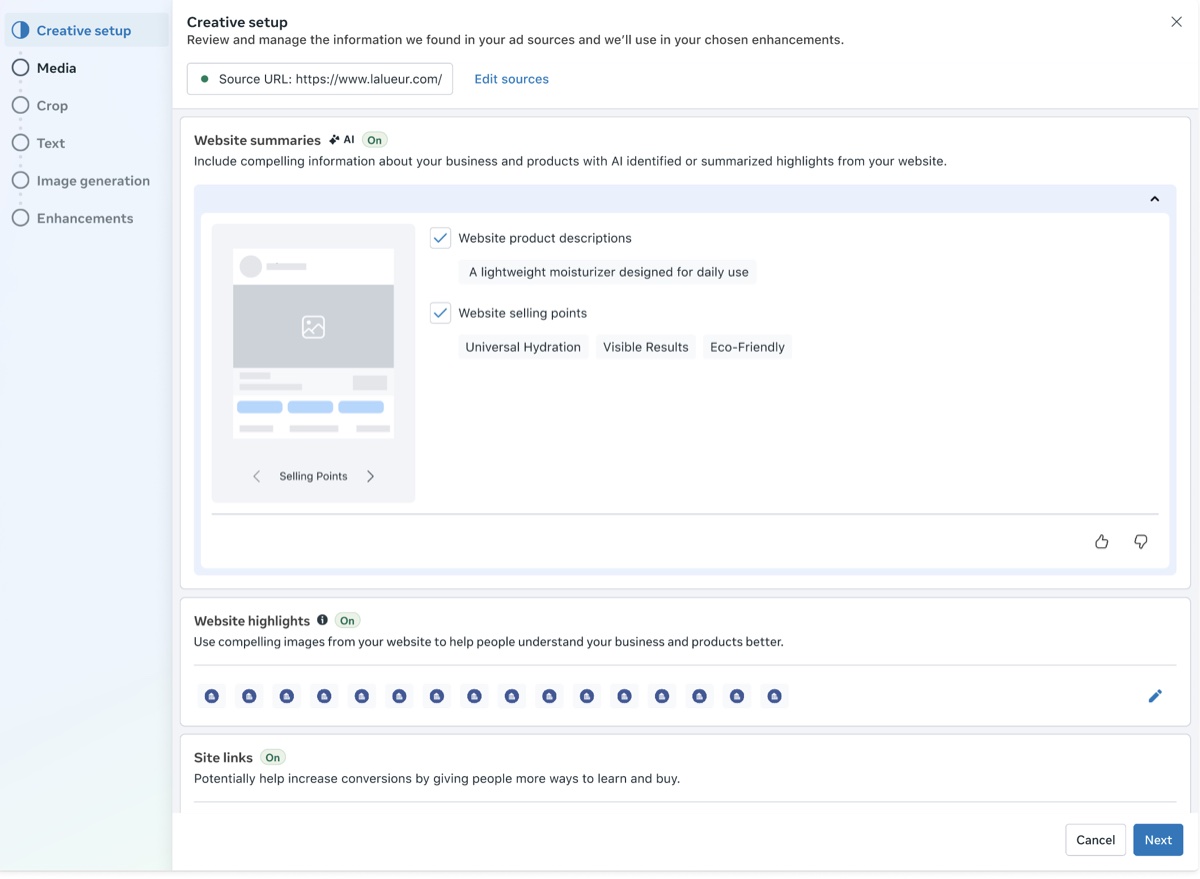
Old experience: in the first step of this modal, advertisers opt into ad sources.
For the business
- Transparency had already failed once. Earlier tests showed interactive experiences earlier in the creative modal, and adoption dropped by 14.8%. The team rolled it back.
- Meta needed low opt-out rates to launch to every advertiser. Those opt-outs also had to come from informed choices, not from confusion.
Goal
Show advertisers how their metadata appears in interactive experiences without losing adoption. We tracked three measures:
- Transparency: More advertisers see the new card than saw the old preview screen.
- Adoption: No drop.
- Control: Fewer than five advertiser escalations a month.
Our longer-term bet was that clear information would build trust, and trust would raise adoption.
Key decisions
1. Ask advertisers why they opted out
- The team had few direct signals from advertisers. We had a few research studies and some complaints passed on by the sales team, so most decisions about what to show in-product were guesses. With our UX researcher, I designed an in-product survey that asked advertisers why they turned interactive experiences off.
- The answers pointed to one cause: advertisers did not understand how Meta used their metadata. They saw their ad sources in one place and interactive experiences in another, and they could not connect the two. This finding set the direction for the redesign, which was to put them side by side.
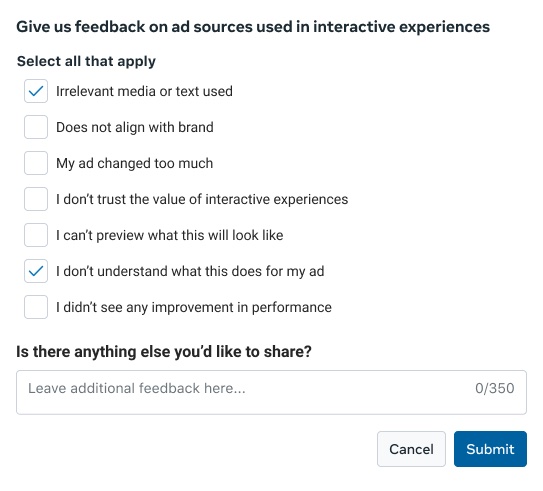
2. Put metadata and interactive experiences in one new card, and move control to the metadata
- My product design partner and I outlined four places these products could live:
Number Option Result 1 Metadata and interactive experiences on one screen in the creative modal Too much to review at once 2 A new card in ad setup, with metadata shown in context Visible and focused 3 Move into the creative modal A related test cut adoption 4 Keep in advanced preview Still hidden - We proposed #2, which eventually shipped.
- Next, the team had to decide how advertisers would control these interactive experiences. Before, advertisers approved their ad sources in one step and turned each feature on or off in another. We proposed removing the on/off switch for each experience and moving the control to the ad sources. Now advertisers choose which ad sources flow into each interactive experience.
- The team was comfortable removing the switch because these features do not change the advertiser's own image or video. This model only works if advertisers can see which data powers which feature. I shaped the content around two principles:
- Show every pairing. For each interactive experience, advertisers see the ad sources that feed it, with a preview of the result.
- Give each pairing its own control. Advertisers can stop one ad source from feeding one interactive experience without turning off anything else.
- This design added choices. With three types of metadata and three interactive experiences, advertisers went from about six choices to twelve. We accepted the longer list because advertisers needed to see the link between their metadata and each interactive experience.
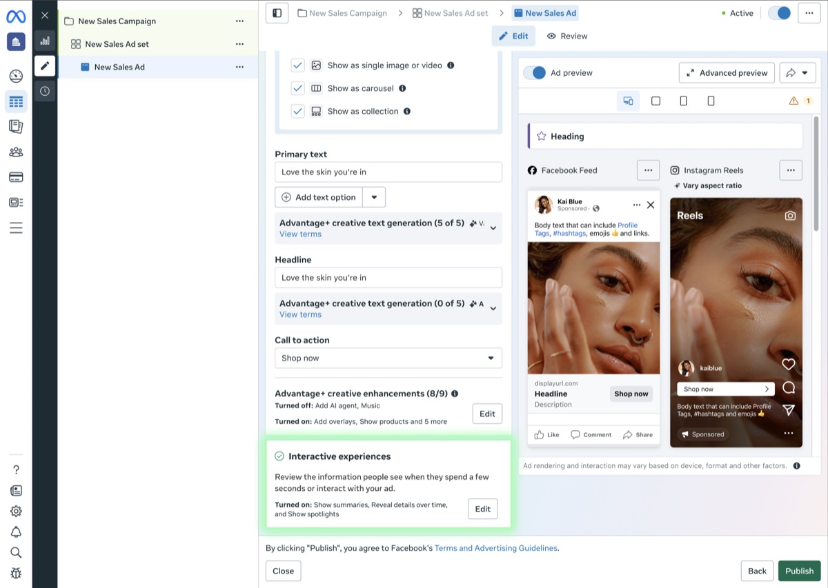
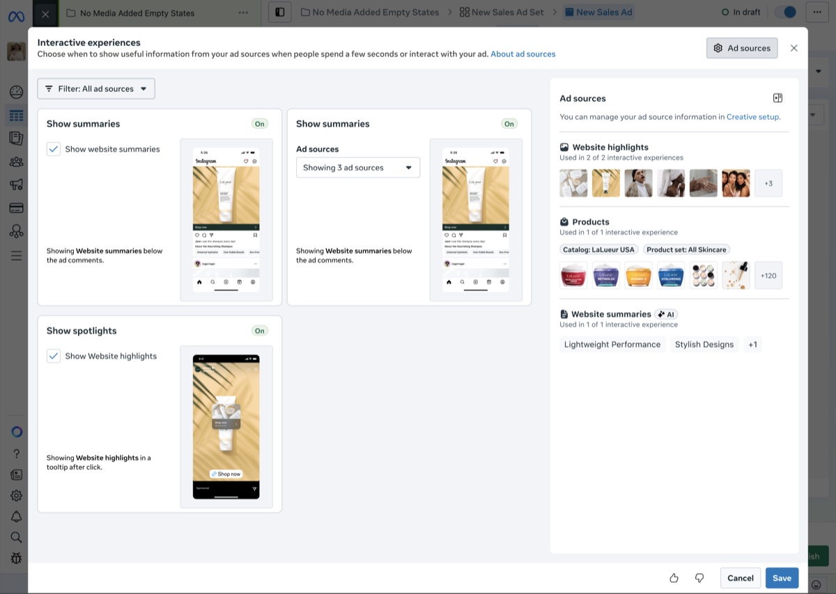
New experience.
3. Name and group a new kind of feature
- These products needed a name that advertisers would not confuse with creative enhancements, which alter the advertiser's image or video asset. Interactive experiences leave the creative untouched, so grouping them with enhancements would make them seem riskier than they are and could drive opt-outs.
- I put forward several names, and the team aligned on "interactive experiences" because it described what people do with the ad. Under this category, I built a naming system with four layers, so each name told advertisers one thing.
Layer Name What it tells advertisers 1 Category Interactive experiences Products that control what people can see and do after spending a few seconds with your ad 2 Ad products Show summaries, Show spotlights, Reveal details over time What advertisers will opt into; follows Ads Manager naming conventions 3 Metadata source Ad sources Where the information comes from 4 Metadata Information from your ad sources Information
Outcomes
- Interactive experiences shipped to all advertisers by mid-2026, and the team met every target it set. 99% kept their ad sources on and there were zero advertiser escalations to our sales teams. Survey feedback on the new section was positive.
- Most importantly, it reversed the earlier lesson that transparency hurt adoption. We proved that transparency, at the right moment, builds trust instead of hurting adoption. That cleared the way to move all interactive experiences and ad sources into the new card.
Reflection
- I would question inherited rules sooner. One rolled-back test had turned into the rule "show advertisers less," and nobody had checked why the test failed. Next time, I would push for evidence before a belief like that shapes product strategy.
Peer feedback
"He put forth multiple taxonomy options and helped the team align around the one that was most intuitive, which helps to simplify the complex surface. He was also exhaustive in his approach to develop intuitive names for these features, which are not the simplest to describe."Product Manager
"I especially appreciated how he broke down the data consent flows into clear categories and surfaced the most important information."Product Designer
"Based on the launch result, we now know the [feature] taxonomy and feature naming are successful without causing any escalations or confusions."Software Engineer